I dislike live search, mostly because of the way the results pages look. But I have a three liner fix that could make live search so much better.
First look at the default output for live search:
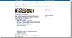
The text is all centered. The problem with this is that the margin against which it is centered is a false margin. It is imaginary. This confuses my mind. I look at this page and it makes very little sense. It is hard to read. I cannot go from link to link easily, and the link hierarchy is lost.
Let's look at my favorite search engine, Google, and how they display results:

Why is this better? It is better because the text margin is real - the side of my screen. It is easy to go from link to link, and hierarchies work fine in this display.
So how can I fix live search? A simple three liner will do it. I'm not sure how your site is laid out since you seem to be including the style in the page (bad Microsoft), and using a newline stripper on top of that (I hope it isn't like the one I wrote once, not because it is special or I want to sell it, but because mine was really slow and un-optimized). But wherever your style page is, remove:
#sb_width
{
    margin: 0pt auto;
    max-width: 990px;
    _width: 990px;
}
That's it! For completeness also remove the text-align:center on #sb_page, just for older versions of Internet Explorer. The end result will look like this (thank you Firebug!):

So much better! I might actually consider trying live search if it looked like this. If anyone actually knows greasemonkey, and wants to write a script to do this, please do, and I will link to it!
Notice: My suggestion may be used at any time, without credit, without any form of compensation, and without notice, or anything else. You can use it freely Microsoft. Really. Please do.
[NOTE]I am aware of how lame the images are. I will replace them soon with higher quality versions...


No comments:
Post a Comment